Home
Infographics
Book
Tools
Tools Directory
DataViz Guides
DataViz Shows
Word Clouds
Sankey Diagrams
Online Infographics Design
Online DataViz
Analytics Platforms
Infographic Resumes
Vector Graphics
Icon Libraries
Color Pickers
Presentation Design
JavaScript Charts
Free Stock Images
Jobs
Posters
Links
Appearances
About
Contact
Follow Cool Infographics
Need Infographics?
Randy Krum
Designer | Author | Instructor | Speaker
FREE Sample Chapter
Read More
All tagged
planets
Sep
15
Sep 15
Planets Mean Temperatures
Randy Krum
Oct
16
Oct 16
The Ultimate Loss
Randy Krum
Jun
25
Jun 25
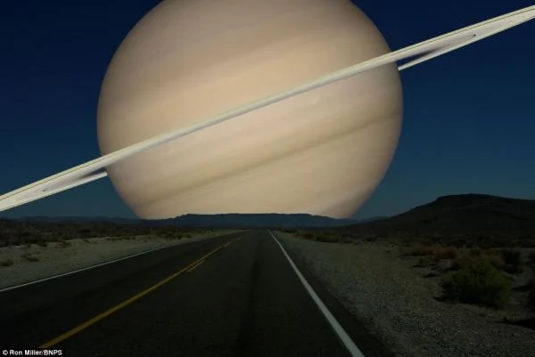
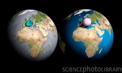
Planets in Orbit Around Earth!
Randy Krum
Nov
14
Nov 14
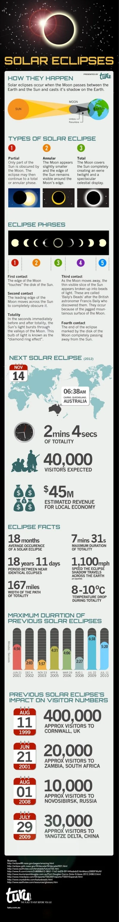
Total Solar Eclipse 2012
Randy Krum
Jul
13
Jul 13
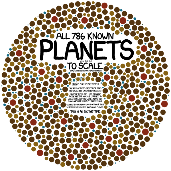
Exoplanets: 786 Known Planets
Randy Krum
Jun
9
Jun 9
Our Amazing Planet: Top to Bottom infographic
Randy Krum
Dec
29
Dec 29
Visualizing Gravity Wells - infographic comic
Randy Krum
Dec
7
Dec 7
Scale Model of the Solar System
Randy Krum
Nov
23
Nov 23
Probes in the Universe - cool interactive infographic
Randy Krum
Oct
13
Oct 13
50 Years of Space Exploration - Visual Flight Map
Randy Krum
Mar
23
Mar 23
Planets, a Solar System Visualizer
Randy Krum
Feb
24
Feb 24
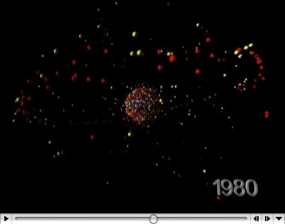
Space Debris video
Randy Krum
Feb
23
Feb 23
Space Debris image
Randy Krum
Dec
1
Dec 1
Voyager Infographic video
Randy Krum
Jul
30
Jul 30
Bio-Suit EVA Infographic Poster
Randy Krum
Jun
27
Jun 27
Big Blue Marble: Water and Air
Randy Krum
Mar
30
Mar 30
Dark Matter distorts light
Randy Krum
Jan
20
Jan 20
Race to the Moon
Randy Krum
Nov
22
Nov 22
Timeline of Space Exploration
Randy Krum
Oct
15
Oct 15
Potential Solar Energy
Randy Krum
Load More