Home
Infographics
Book
Tools
Tools Directory
DataViz Guides
DataViz Shows
Word Clouds
Sankey Diagrams
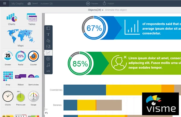
Online Infographics Design
Online DataViz
Analytics Platforms
Infographic Resumes
Vector Graphics
Icon Libraries
Color Pickers
Presentation Design
JavaScript Charts
Free Stock Images
Jobs
Posters
Links
Appearances
About
Contact
Follow Cool Infographics
Need Infographics?
Randy Krum
Designer | Author | Instructor | Speaker
FREE Sample Chapter
Read More
All tagged
online
Sep
19
Sep 19
40 Facts About the Psychology of Color
Randy Krum
Mar
28
Mar 28
Will Your Meeting Suck?
Randy Krum
Oct
27
Oct 27
9 Great DataViz & Infographics Tools with Education Discounts
Randy Krum
Oct
22
Oct 22
2014 Higher Education Technology Landscape
Randy Krum
Oct
2
Oct 2
Online Sales Trends - Color Matters
Randy Krum
Apr
24
Apr 24
Smart Ways to Combine Content Marketing With SEO
Randy Krum
Nov
20
Nov 20
The Online Shopping Cart Experience
Randy Krum
Jul
5
Jul 5
The Conversation Prism 4.0 for 2013
Randy Krum
Apr
25
Apr 25
The 2012 Adobe U.S. Digital Video Benchmark
Randy Krum
Jan
7
Jan 7
Can You Protect Yourself from Hackers at CES?
Randy Krum
Jul
9
Jul 9
Best Times to Tweet or Post on Facebook
Randy Krum
Jun
29
Jun 29
The Massive Challenge of Search Engine Complexity
Randy Krum
Jun
26
Jun 26
Ruby on Rails Popularity Index 2012
Randy Krum
Jun
13
Jun 13
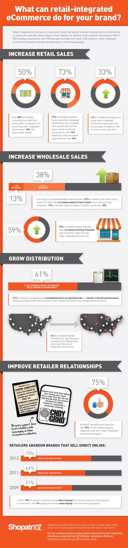
The Value of Retail-Integrated eCommerce
Randy Krum
Jun
13
Jun 13
Digital Anatomy of the Affluent Male
Randy Krum
May
17
May 17
INDi Unzipped - A Visual Business Plan?
Randy Krum
May
7
May 7
How Has Internet Changed Education?
Randy Krum
Apr
24
Apr 24
Gov 2.0 Infographic: Bringing the Tobacco Control Act to Life
Randy Krum
Apr
23
Apr 23
The Rise of the Slacktivist
Randy Krum
May
4
May 4
Real Estate: Social Media Killed the Blog Star
Randy Krum
Load More