Home
Infographics
Book
Tools
Tools Directory
DataViz Guides
DataViz Shows
Word Clouds
Sankey Diagrams
Online Infographics Design
Online DataViz
Analytics Platforms
Infographic Resumes
Vector Graphics
Icon Libraries
Color Pickers
Presentation Design
JavaScript Charts
Free Stock Images
Jobs
Posters
Links
Appearances
About
Contact
Follow Cool Infographics
Need Infographics?
Randy Krum
Designer | Author | Instructor | Speaker
FREE Sample Chapter
Read More
All tagged
news
Jan
4
Jan 4
2016 The Year In Colour
Randy Krum
Feb
5
Feb 5
January Roundup of DataViz News
Randy Krum
Jan
6
Jan 6
Infogr.am Acquires Infographics Blog Visualoop
Randy Krum
Jan
6
Jan 6
The Evolution of Reddit
Randy Krum
Aug
22
Aug 22
Worldwide ATM Cyber Attack
Randy Krum
May
30
May 30
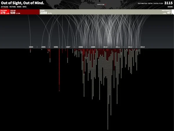
Drones Kill - Animated, Interactive Visualization
Randy Krum
Feb
7
Feb 7
Syria: The Basics, an infographic presentation
Randy Krum
Aug
18
Aug 18
The Power of Data Visualization: iPhone Tracking
Randy Krum
Mar
23
Mar 23
Japan: The Earthquake & The Tsunami [infographic]
Randy Krum
Feb
7
Feb 7
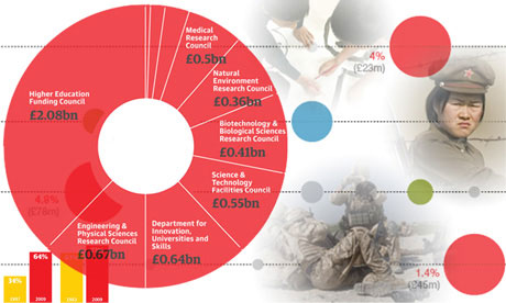
Fuel Poverty with the Over-60 Crowd in England
Randy Krum
Jan
6
Jan 6
The 2010 Year in Review #infographic
Randy Krum
Dec
16
Dec 16
DataStore - Launched at The Guardian
Randy Krum
Dec
30
Dec 30
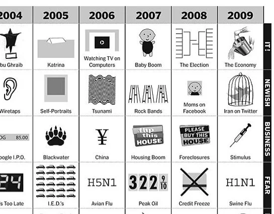
The Last 10 Years...Visually
Randy Krum
Dec
18
Dec 18
Word Spectrums! The Online Infographic Battleground
Randy Krum
Oct
28
Oct 28
A Graphic History of Newspaper Circulation
Randy Krum
Sep
10
Sep 10
HealthMap: The Global Disease Alert Map
Randy Krum
Apr
7
Apr 7
Can design save the newspaper? (Jacek Utko)
Randy Krum
Mar
17
Mar 17
Bad News for Newspapers
Randy Krum
Mar
3
Mar 3
TimeSpace - World
Randy Krum
Feb
20
Feb 20
Google Data Visualization Concepts
Randy Krum
Load More


![Japan: The Earthquake & The Tsunami [infographic]](https://images.squarespace-cdn.com/content/v1/5bfc8dbab40b9d7dd9054f41/1552969898901-ZZ37TKZ5YAZ06M6O2LI1/japan_earthquake_tsunami_infographic.jpg)