Home
Infographics
Book
Tools
Tools Directory
DataViz Guides
DataViz Shows
Word Clouds
Sankey Diagrams
Online Infographics Design
Online DataViz
Analytics Platforms
Infographic Resumes
Vector Graphics
Icon Libraries
Color Pickers
Presentation Design
JavaScript Charts
Free Stock Images
Jobs
Posters
Links
Appearances
About
Contact
Follow Cool Infographics
Need Infographics?
Randy Krum
Designer | Author | Instructor | Speaker
FREE Sample Chapter
Read More
All tagged
map
Mar
16
Mar 16
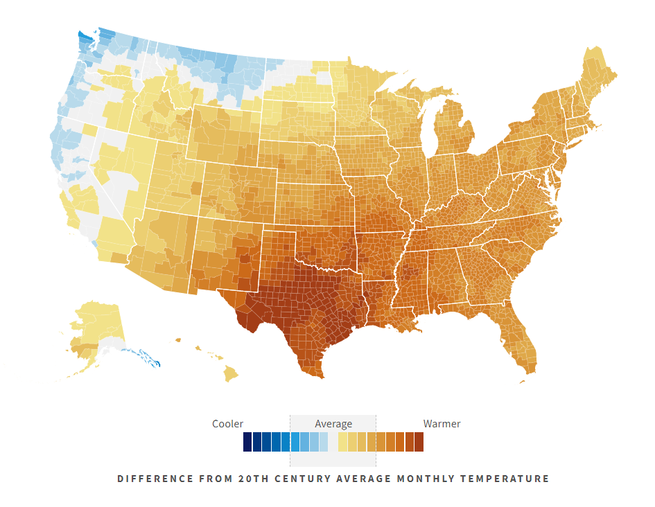
Climate in the United States
Randy Krum
Mar
22
Mar 22
Should You Hate Daylight Saving Time?
Randy Krum
Jan
25
Jan 25
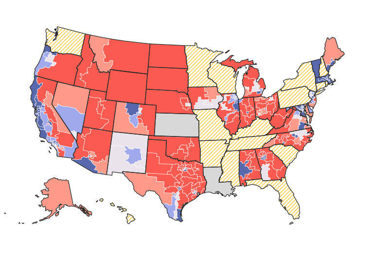
What Redistricting Looks Like in Every State
Randy Krum
May
18
May 18
The United Fonts of America
Randy Krum
Sep
4
Sep 4
Extremely Detailed 2016 Election Map
Randy Krum
Aug
21
Aug 21
How America Uses its Land
Randy Krum
Oct
3
Oct 3
SwissLeaks: the map of the globalized tax evasion
Randy Krum
Aug
9
Aug 9
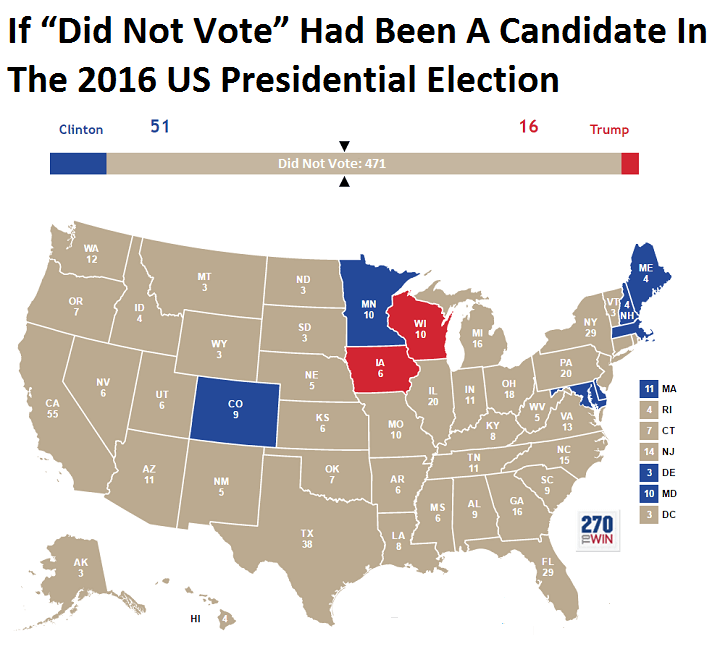
Landslide for the "Did Not Vote" Candidate in the 2016 Election!
Randy Krum
Mar
20
Mar 20
What 770,000 Tubes of Saliva Reveal About America
Randy Krum
Jan
9
Jan 9
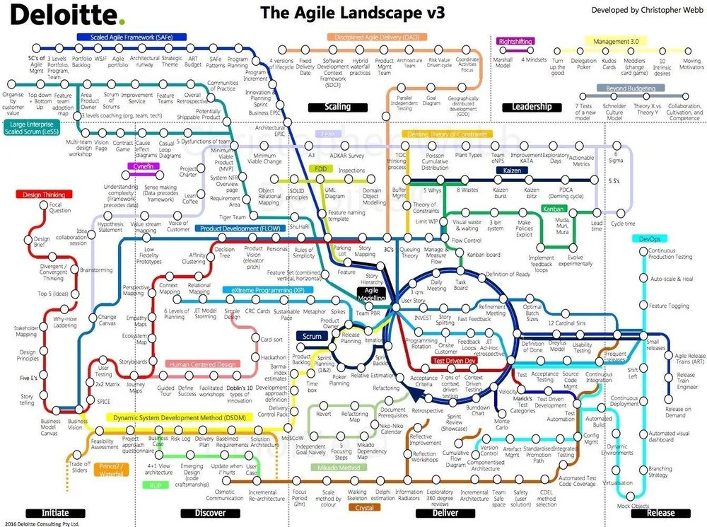
Navigating The Agile Landscape
Randy Krum
Dec
1
Dec 1
Thanksgiving Flight Patterns
Randy Krum
Nov
7
Nov 7
Visual History of US Population
Randy Krum
Sep
29
Sep 29
Visualizing the Fortune 500
Randy Krum
Aug
16
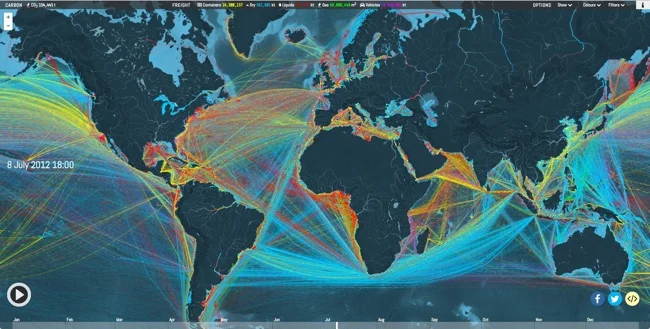
Aug 16
Animated and Interactive Global Shipping Visualization
Randy Krum
Jul
13
Jul 13
Global Connectivity Ranking
Randy Krum
Jun
29
Jun 29
The U.S. MiseryMap of Flight Delays
Randy Krum
Jun
24
Jun 24
How Britain Voted in the E.U. Referendum
Randy Krum
Jun
3
Jun 3
The Global Air Transportation Network
Randy Krum
May
13
May 13
American Slavery Maps
Randy Krum
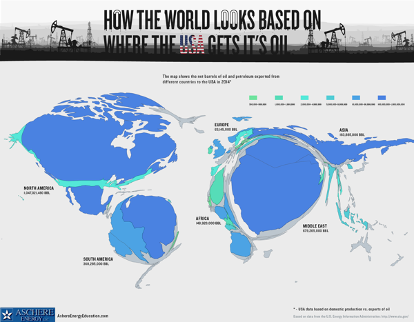
Dec
29
Dec 29
Where The USA Gets Its Oil
Randy Krum
Load More