Home
Infographics
Book
Tools
Tools Directory
DataViz Guides
DataViz Shows
Word Clouds
Sankey Diagrams
Online Infographics Design
Online DataViz
Analytics Platforms
Infographic Resumes
Vector Graphics
Icon Libraries
Color Pickers
Presentation Design
JavaScript Charts
Free Stock Images
Jobs
Posters
Links
Appearances
About
Contact
Follow Cool Infographics
Need Infographics?
Randy Krum
Designer | Author | Instructor | Speaker
FREE Sample Chapter
Read More
All tagged
history
Mar
25
Mar 25
How Long Do Animals Live?
Randy Krum
Mar
29
Mar 29
The Evolution of UK Company Logos
Randy Krum
Jul
28
Jul 28
The History of Barbie
Randy Krum
Sep
7
Sep 7
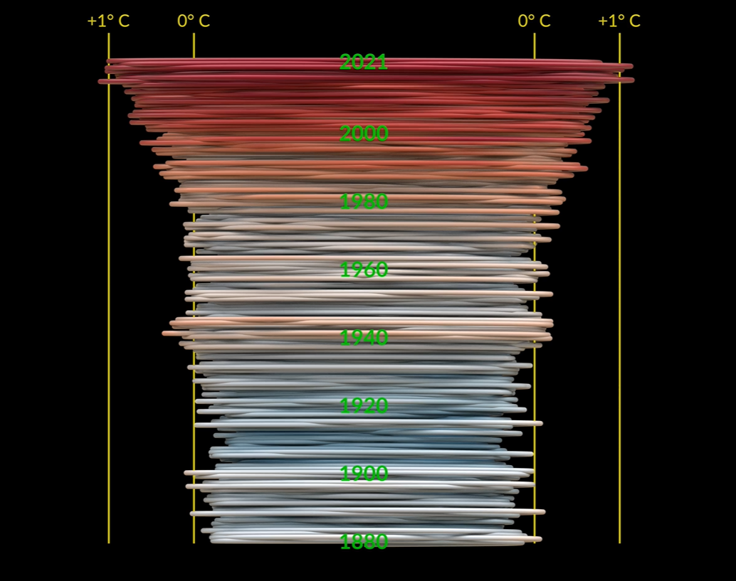
GISTEMP Climate Spiral
Randy Krum
May
13
May 13
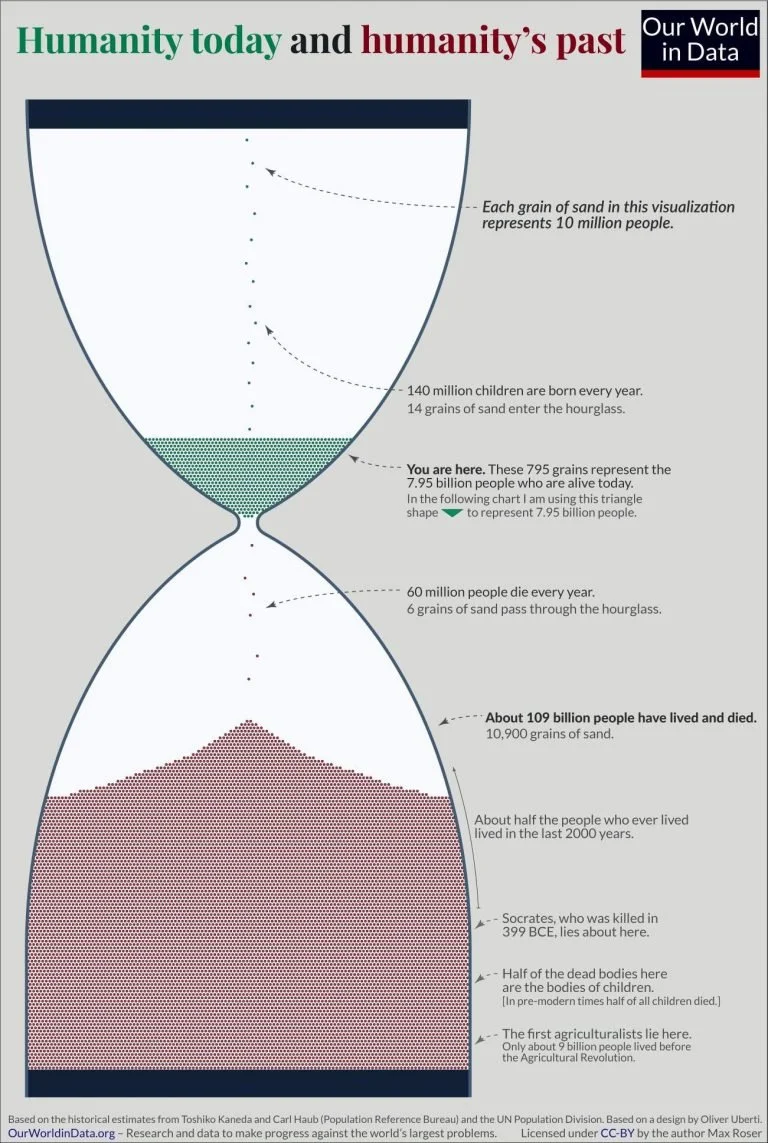
Visualizing Everyone that has Ever Lived
Randy Krum
Oct
25
Oct 25
Nature Timespiral
Randy Krum
Feb
3
Feb 3
Punxsutawney Phil vs. the U.S. National Weather Service
Randy Krum
Nov
27
Nov 27
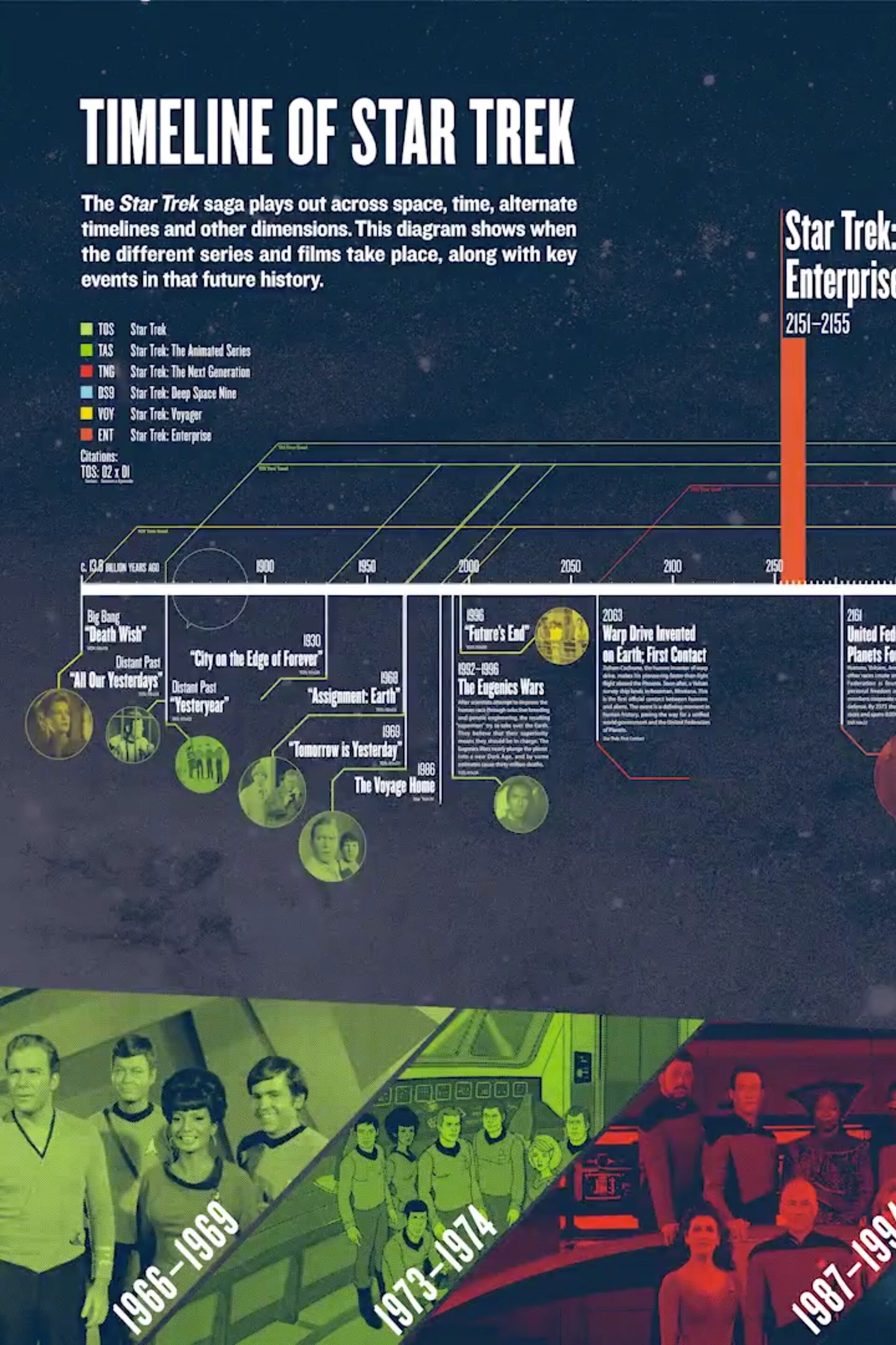
Official Timeline of Star Trek
Randy Krum
Apr
5
Apr 5
5,000 Year Timeline of Medical Technology
Randy Krum
Mar
14
Mar 14
Ancient History Family Trees Poster
Randy Krum
Mar
5
Mar 5
The Evolution of Captain Marvel
Randy Krum
Feb
27
Feb 27
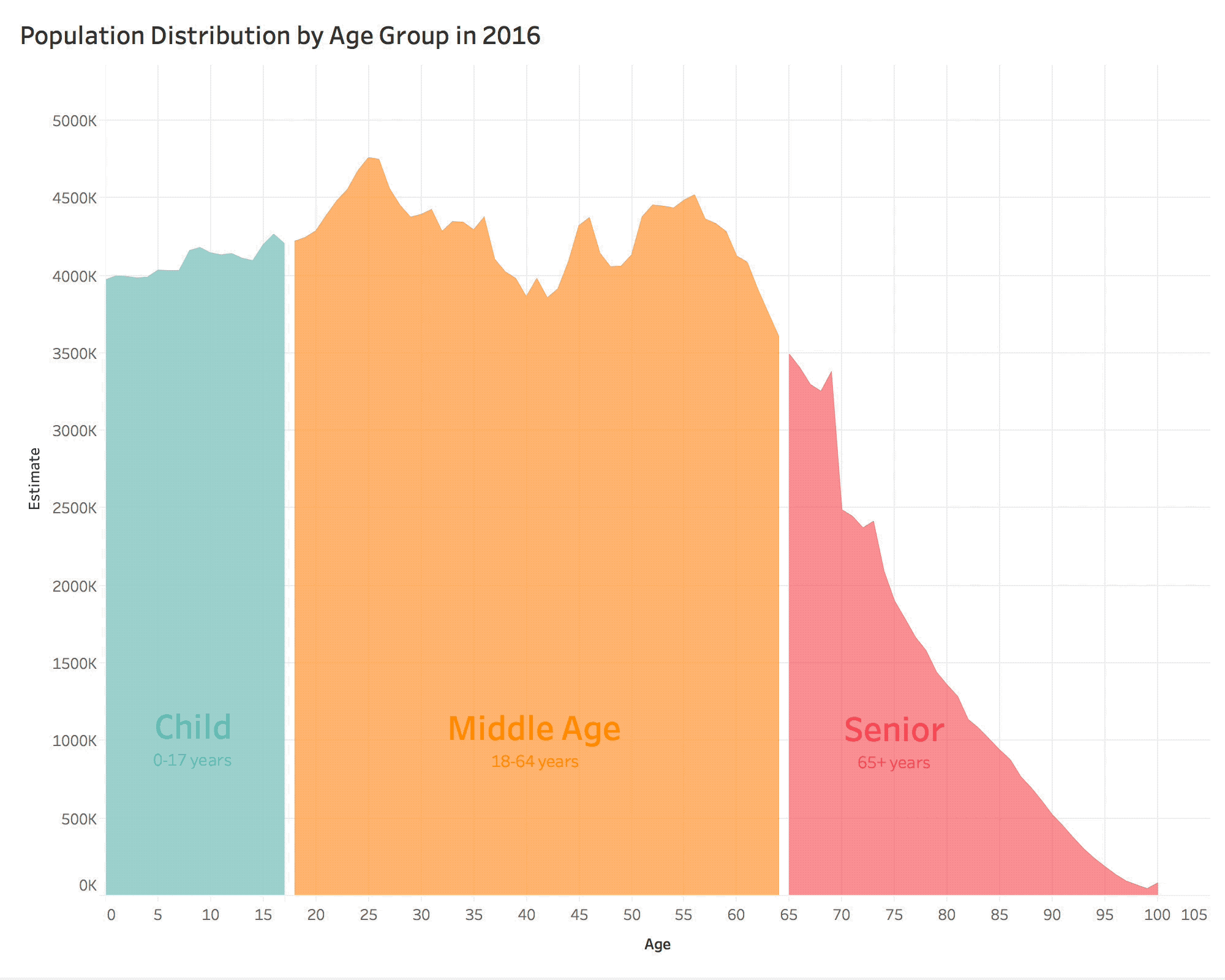
US Population Projections by Age Through 2060
Randy Krum
Feb
7
Feb 7
Time & Space Visualiser
Bex
Feb
4
Feb 4
How The World is Getting Better in 6 Charts
Randy Krum
Jan
17
Jan 17
The Visual Compendium of Sitcom Sofas
Randy Krum
Sep
17
Sep 17
Animated History of Home Siding Materials
Randy Krum
May
15
May 15
Evolution of the English Alphabet
Randy Krum
Mar
2
Mar 2
The Texas Infographic
Randy Krum
Feb
6
Feb 6
The ICO Explosion of 2017
Randy Krum
Oct
23
Oct 23
A Brief History of Printing
Randy Krum
Load More