Home
Infographics
Book
Tools
Tools Directory
DataViz Guides
DataViz Shows
Word Clouds
Sankey Diagrams
Online Infographics Design
Online DataViz
Analytics Platforms
Infographic Resumes
Vector Graphics
Icon Libraries
Color Pickers
Presentation Design
JavaScript Charts
Free Stock Images
Jobs
Posters
Links
Appearances
About
Contact
Follow Cool Infographics
Need Infographics?
Randy Krum
Designer | Author | Instructor | Speaker
FREE Sample Chapter
Read More
All tagged
flowchart
Nov
25
Nov 25
Leftover Turkey Flowchart
Randy Krum
Apr
11
Apr 11
Can I Claim my Lunch on the Go?
Randy Krum
Feb
13
Feb 13
Can I Use that Picture?
Randy Krum
Mar
16
Mar 16
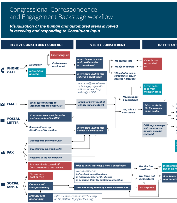
Where Constituent Input Ends Up
Randy Krum
Mar
7
Mar 7
Which Sci-Fi Movie Should I Watch?
Randy Krum
Mar
28
Mar 28
Will Your Meeting Suck?
Randy Krum
Jun
8
Jun 8
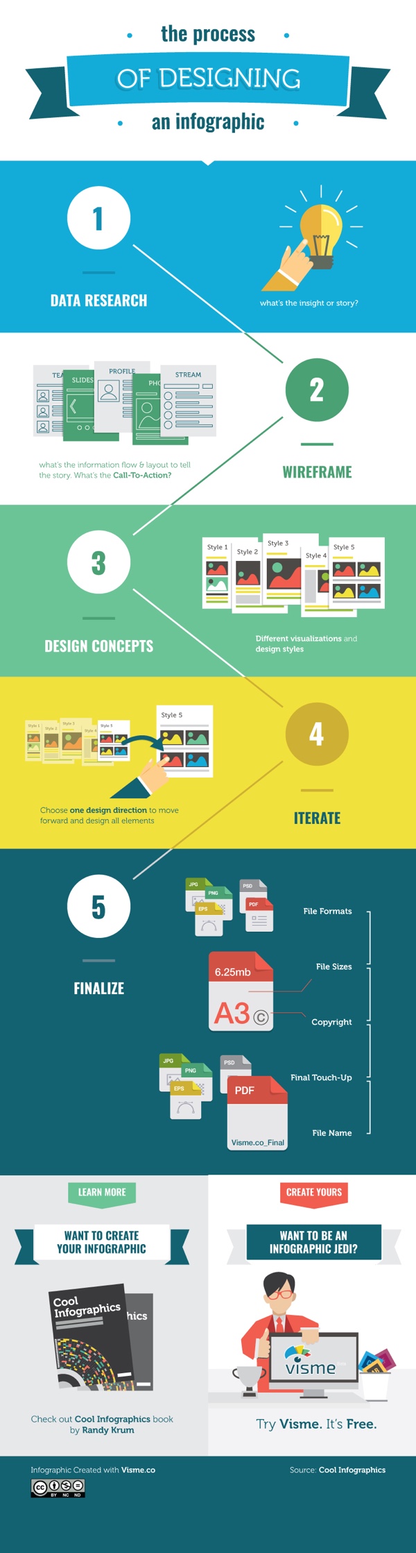
The Process of Designing an Infographic
Randy Krum
Nov
4
Nov 4
Find The Best Group Exercise Class for You
Randy Krum
Sep
25
Sep 25
Your One Month Guide To Beating Clutter
Randy Krum
Aug
12
Aug 12
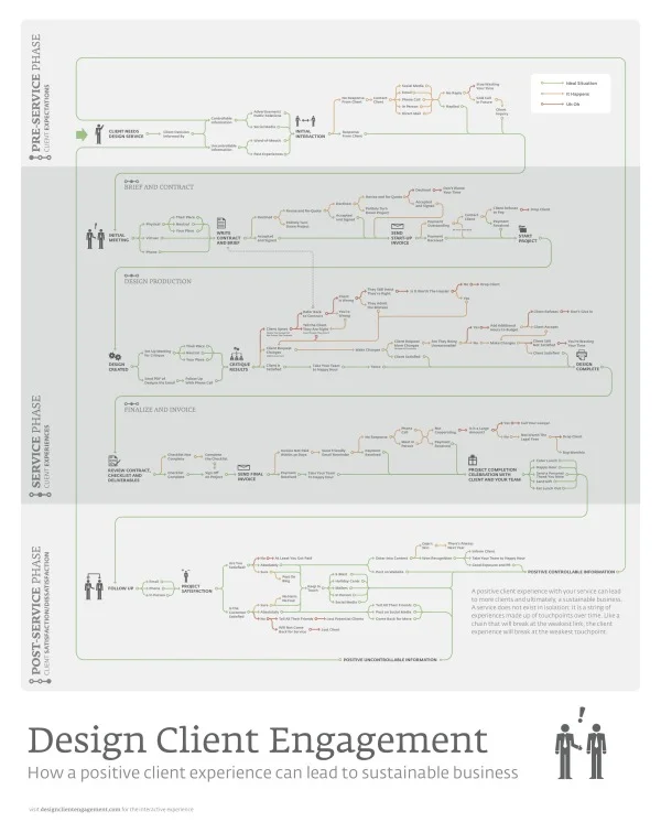
Design Client Engagement Poster
Randy Krum
Jul
22
Jul 22
What the Health? Understanding Obamacare's 11 Year Health Plan
Randy Krum
May
16
May 16
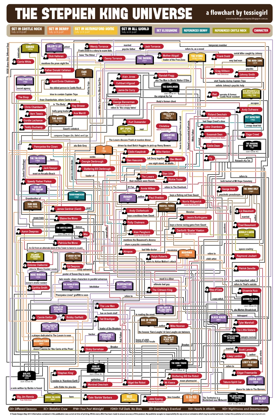
The Stephen King Universe
Randy Krum
Sep
24
Sep 24
Star Wars Infographic Flowcharts
Randy Krum
Feb
15
Feb 15
Website Hosting Decisions
Randy Krum
Oct
20
Oct 20
The Socially Optimized Business
Randy Krum
Oct
12
Oct 12
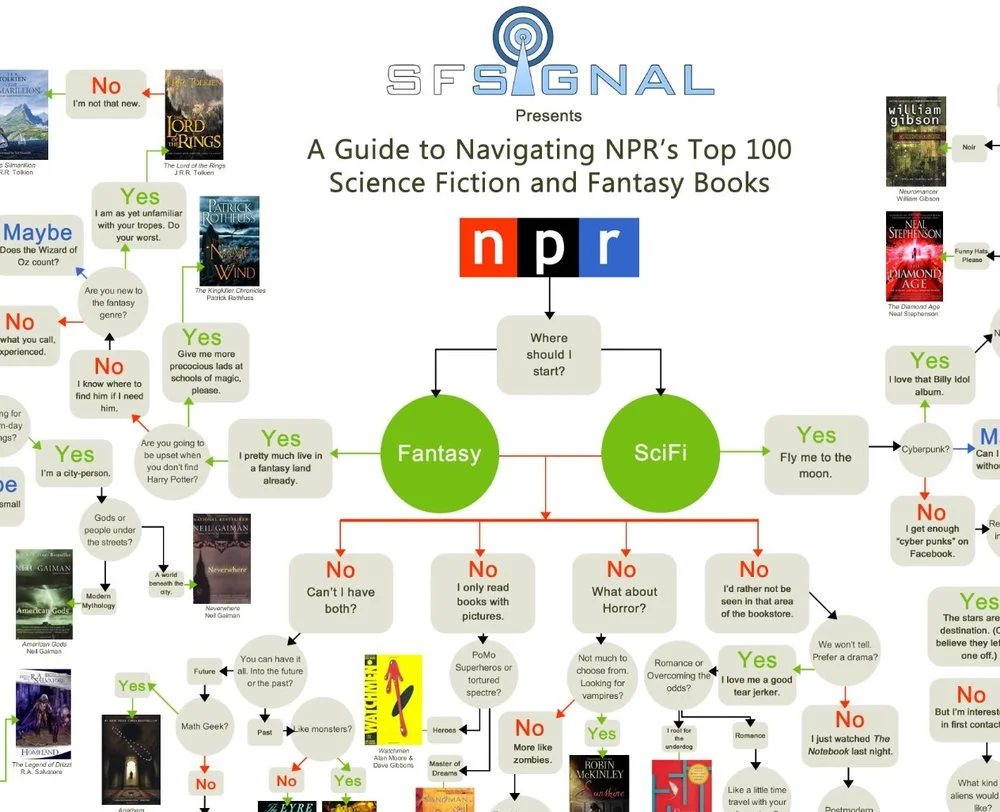
Top 100 SciFi and Fantasy Books Flowchart
Randy Krum
May
16
May 16
Client Infographic: How Affiliate Marketing Works
Randy Krum
Mar
24
Mar 24
Google's Collateral Damage
Randy Krum
Feb
8
Feb 8
What Kind of Pasta is on Your Plate? #infographic
Randy Krum
Jan
13
Jan 13
Should I Work for Free? - a flowchart
Randy Krum
Load More