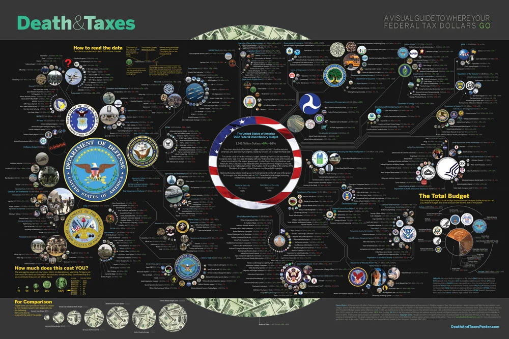
About

Randy Krum infographic designerRandy Krum

President of InfoNewt.
Data Visualization, Infographic Design, Visual Thinking, Product Development and Marketing professional fascinated by good infographics.  Always looking for better ways to get the point across.

Infographic Design


InfoNewt Infographic Design

Search the Cool Infographics site

Custom Search


Subscriptions:


Feedburner

The Cool Infographics Gallery:

How to add the
Cool Infographics button to your:

Cool Infographics iOS icon

- iPhone
- iPad
- iPod Touch


Read on Flipboard for iPad and iPhone

Featured in the Tech & Science category

Flipboard icon

Twitter Feed
Caffeine Poster

The Caffeine Poster infographic

Google Insights

Entries in contest (17)

Monday
May032010

Design For America Contest Deadline

The May 15th deadline for the Sunlight Labs’ Design For America contest is quickly approaching!  With $40,000 in prize money available, there’s still time to enter the Data Visualization category (or Process Transparency or Redesigning The Government).
The submission deadline for the Design for America competition is rapidly approaching. Designs are due by May 15th and the winners announced on May 27th. With a grand total of $40,000 in prize money on the line, we would like to invite designers from every corner of the globe to participate. We can’t wait to see the great ideas people have for redesigning government, visualizing data and explaining government processes.

Our team at the Sunlight Foundation put together this video to give a little context about the competition. In addition, our own Ali Felski, one of Design for America’s judges, did a nice write up of competition where she talks about the need for designers to come together to, “overwhelm the government with good design.”

Government information can be so boring and obtuse. Reams of data on spreadsheets and hundreds, even thousands of pages of legalese can unintentionally obscure the real, and beautiful meaning of public information.
Thanks to Brad for reminding me and sending the link!
Wednesday
Apr282010

Jess Bachman Interview (Death & Taxes 2011 Poster Giveaway!!)  #deathandtaxes

Last week, Jess Bachman (@mibi) from WallStats.com released the new 2011 Death & Taxes poster.  I caught up with Jess (by email) to ask some questions about his huge infographic undertaking.  The high-resolution image of the poster is available now online, and the printed version will start shipping on May 7th.  You can pre-order for $24, and the shipping cost is only $0.75 TODAY (April 28th)

WIN a copy of the poster!  Jess has been kind enough to offer a free poster to a reader of Cool Infographics.  To be eligible, you must tweet (or retweet) a link to this post on Twitter before May 7th, and include the #deathandtaxes hashtag.  I included the hashtag in the post title, so any retweets will be automatically eligible.  NOTE: you must also be following me on Twitter (@rtkrum) so that I can send you a DM if you have won!

Death and Taxes” is a large representational graph and poster of the federal budget. It contains over 500 programs and departments and almost every program that receives over 200 million dollars annually. The data is straight from the president’s 2011 budget request and will be debated, amended, and approved by Congress to begin the fiscal year. All of the item circles are proportional in size to their funding levels for visual comparison and the percentage change from both 2010 and 2001 is included so you can spot trends.

The detail in this poster is stunning, and in this small shot you can see how the total budget request breaks out. Only the “Military/Nat. Security Discretionary” and “Non-Military/Nat. Security Discretionary” portions of the budget request details are displayed in the poster.


Jess was also nice enough to answer a few interview questions I sent him:

Cool Infographics: What software applications do you use for the Death & Taxes posters?

Jess Bachman: The only applications I use are Photoshop and Excel.  Excel is where I in put all the data and it crunches the numbers, adjusts for inflation and calculates diameters.  Photoshop is where I put it all together and the PSD file occasionally exceeds 1 gig so it can be a beast to work with.  Saving takes about 5 minutes.

Cool Infographics: What’s your design process?

Jess Bachman: Normally I start from scratch and layout the images and make them fit; however, this year the budget didn’t change all that much, likely being from the same President, so I was able to keep the 2010 format and change the size of circles.  Of course some things had to be added and removed.  So this year I saved myself about 3 weeks of work just getting right into it, but the design process is grueling.  it’s small tasks, repeated 500 times.

Cool Infographics: What’s the most interesting thing you learned from the data?

Jess Bachman: I can definitely see the differences in Presidents from Bush to Obama.  Lots of reductions on the military side this year and the whole security climate as a whole isn’t as fiscally robust as it was a few years ago.  Much more progressive funding with Obama too.  Every year Bush would cut climate change research, now its back, along with other green tech.  For some reason, public proadcasting gets the hack saw every year no matter who’s in office.

Cool Infographics: Where are some of your favorite places that have the Death & Taxes poster on display?

Jess Bachman: Well it’s always good to see it on display in schools and classrooms.  But I really enjoy hearing from military members who have in their offices or even in station.  I have sent several to Afghanistan.  Critics often say the poster is anti-military, but the military is quite receptive to it, even the former Dept. of Defense Comptroller, Tina Jonas, loved the poster.  Some people from the Dept of Energy’s Oak Ridge Lab displayed the poster on their 30’ Everest computer screen… that was cool too.

Cool Infographics: What’s the hardest part when developing the poster?

Jess Bachman: The hardest part is just getting through all the rote data processing and mindless photoshopping.  The research side is quite fun, and going through the military budgets is a trip with all their classified and hi-tech programs. However, copying and pasting 5,000 times really takes a toll on my creativity and motivation.

Cool Infographics: You said you do a lot of copy & paste work, in what format do you get the data?

Jess Bachman: Some of the government data is in Excel already, but there is no context so I am dubious about working solely with their data sets.  Mostly I pull the numbers from the actual printed budget, which is in PDF form.  So I end up copying and pasting the program name and its funding level for 3 years into Excel, then I copy and paste the program name, funding level, and percentages back into photoshop as a text layer.  Rinse and repeat 500 times.  Many people ask if there was an automated way to create the poster each year and I wish there was, but the confines of the paper make size and fit a manual process.

Cool Infographics: Where do you have them printed, what are the printing specs and why?

Jess Bachman: I get my posters printed from a company called PrintPelican in Florida.  There really are no cheaper prices out there but I opt for a thicker cut of paper than usual.  I get 100# gloss cover which is a few shades from a business card in thickness.  To be honest, they have screwed up my order a few times over the years but we have always managed to work it out.  I usually print runs of 1000-2500 and always 24” x 36”.

Cool Infographics: How do you handle all of the printing and shipping of the posters?  Do you tube them yourself?

Jess Bachman: I used to do it all myself.  I had a 400lb brick of posters next to my bed, and 12 giant boxes of tubes all over the house, and I would roll pack and ship them all.  Now I use two shippers who do fulfillment of the orders for me.  For a while I would send them the orders and addresses weekly but I have offloaded that duty as well.  I think the self shipping method is a good lesson in customer service and its good to know your product inside and out, but after while my time became more valuable than stuffing tubes could afford.

Cool Infographics: You’ve used a few different online zoomable image services in the last few years, what have you learned?

Jess Bachman: There are lots of zooming options out there and new ones seem to pop up all the time.   I used Zoomify until it felt too clunky and slow, then Zoomorama which I really loved for its performance and options.  This year I experimented with an self hosted open source app called Open Zoom and it certainly was a slick and great user experience, unfortunately the demands it placed on my server from huge inflows of traffic proved too much, taking down the whole site.  So I had to switch to my backup, which was Closr.it, and let them deal with server demands.  Closr.it has been very attentive to my needs and I have found that most developers will work with me to tailor a custom solution if I ask.  The zooming apps keep getting better so I expect to keep changing apps as long as the space keeps innovating.

Cool Infographics: You mentioned the 30’ display, have you printed it out in larger sizes?

Jess Bachman: No, I have not printed it out any larger.  The file being Photoshop, and the images being mostly rastered do not allow quality printing beyond the poster size.  The file is 300 dpi so I could get away with a slightly larger size, but oversize printing is expensive and who wants a poster that big anyways. 

Cool Infographics: Where do the images come from?

Jess Bachman: Most of the military images come from defenseLINK, which is a great repository for hi-res military photos.  Other images come from stock photography sites for the most part.  It does help that most government logos are round.  I suppose it’s just an old school way of doing things, government seals and all.  The design aesthetic amongst government logos is really all over the map though, and its quite interesting.  Some look like that are from the 1700’s, and some from the 2700’s.

 There was one correction to the online version that Jess has posted:

So I totally had the wrong data for NASA on the visual. Here is the corrected image, which reflects what you have been reading in the news. Science up, space down. I fixed it before it was printed, don’t worry.

You can view the image, buy the poster and more at the new site DeathandTaxesPoster.com.

SPECIAL: If you pre-order the poster TODAY (April 28th) shipping is only $0.75!

Thursday
Apr082010

The Ford Fusion 41 Competition infographic

As part of the advertising behind the Ford Fusion, Ford held a contest with eight teams to break some wacky world records.  Tapping into the public interest in infographics, they worked with designer Thomas Porostocky to develop a visual design they could publish.

The Fusion 41 competition amassed a wealth of raw data generated from all of the teams and activities. To bring these numbers to life we handed the database over to designer Thomas Porostocky who spun it into some amazing poster size visuals. Download the PDF to check out the Fusion 41 stats in their full glory.

This infographic has received some criticism on the web, so I thought I would add a few more comments.  I love the idea that Ford has taken some wacky, strange and funny statistics and visualized them to make them interesting and approachable by viewers.  The results from competitions like “Fastest time to plant a tree”, “Most ‘backseat driving’ comments in 10 seconds” and “Refrigerator magnets stuck to a Ford Fusion” help support the idea that it’s not all serious and the Fusion can be a fun car.  I think the statistics behind the competition are very well focused to be humorous and entertaining to the customer profile that Ford is trying to reach.  I like the grid and speedometer design portions of the poster a lot.

We’ve told the world that the Ford Fusion is up to and up for any challenge. So we chose eight Fusion drivers and their friends to put the Fusion to the test. Every 41 hours for three weeks we tasked these teams to rack up the most points by completing activities with a 2010 Fusion. During those 3 weeks the teams strove to out-score each other across 12 separate activities.  In the end, the team leading in the most Activities walked away with the title of Fusion 41 winner and a Ford Fusion of their own.

I only have two complaints about the infographic myself.  First, I don’t like the over-use of bar charts.  It reminds me of the pages of bar charts that many corporate reports have that could be replaced by a good infographic.  Second, the bright colors used are harsh to the eyes and hard to read.

In December, Ford teamed up with 8 loyal Fusion owners and 4 of their friends to compete in relay challenges that set world records in the 2010 Ford Fusion. Fusion 41 activities included the most turkeys donated to a food bank, most clothes donated to a shelter and most people dancing to the Fusion’s stereo to name a few. The teams had a blast participating in the Fusion 41 program and the results were remarkable!

Take a look and post your thoughts in the comments.  What do you think?

Sunday
Jan312010

Infographic Contest from GOOD Magazine!

A new infographic contest from GOOD Magazine.  Design an infographic looking at the scope and aid given in relation to the earthquake in Haiti.  Deadline is February 9th.  See the GOOD site for complete details and inspiration!

the OBJECTIVE
Highlight the scope of the Haiti earthquake, as well as the aid given to help recover from the disaster.

the ASSIGNMENT
Create an infographic that explores some or all of the following: the toll of the earthquake, why the earthquake was so devastating, the recovery efforts, and the world’s donations of money and aid. We’re offering this contest in collaboration with 
Design for Haiti (a new site by Aaron Perry-Zucker, the man behind Design for Obama and the accompanying bookDesign for Obama—Posters for Change: A Grassroots Anthology), which is collecting information graphics about Haiti. The judging will be done by Perry-Zucker and the editors of GOOD.

the REQUIREMENTS
Send us an e-mail at projects[at]goodinc[dot]com with your infographic or post it to 
GOOD’s Community Blog with the tag “February 2010 Transparency Contest.” It can be in any image format, but it should be high enough resolution that it can be printed at 300 dpi. Make sure to include your sources, and a brief (one- or two-sentence) introduction to your concept. We’ll take submissions now through February 9. The winning entry will be announced on February 16, featured on our homepage and on the Design for Haiti site, and printed in the next issue of GOOD. We’ll send a GOOD T-shirt and a free subscription (or gift subscription) to the winner.

Thanks Tina for the link!

Thursday
Jan142010

The Visual Miscellaneum - Win a Signed Copy!


First of all, The Visual Miscellaneum is a great book of infographics by David McCandless.  


Second, and more importantly, it has sold out in the U.S.  Amazon, Barnes & Noble, Borders and others all show the book to be Out Of Stock.  David has what are potentially the last five copies of the first edition, and he is going to sign them and give them away for free.


Visit David’s site, Information is Beautiful, (you should bookmark his site while you’re there) and post a comment ON HIS SITE under his entry about the last five books.  On Saturday, January 16th, David will choose five people from the comments to receive the free signed copies.


Tuesday
Jan122010

Bronson Wins Infographic Poster!


Congrats to Bronson Harrington (@Gnuboss on Twitter)!  Bronson won a free poster of his choice from Infojocks.com by retweeting about the infographic contest we announced in December.  By including the #BCSvisual hashtag, Bronson was then randomly selected to receive the free poster.

The contest wraps up next week, so look here for all of the entries and the winner.

Thanks to everyone for helping to spread the word!

Friday
Dec042009

Enter the "Visualize The BCS" Infographic Contest! #BCSvisual


Think you can design an infographic?  Well now's your chance to prove it!

Announcing the "Visualize the BCS" contest from InfoJocks.com!  The Bowl Championship Series causes a ton of debate between sports fans over the holidays.  We want you to design an infographic about the BCS.  What to visualize is completely up to you, but must meet two criteria: 1) relate to the BCS and 2) use statistics.  Should be easy, right?

Prizes:  Three winners. Best Entry gets two posters of their choice and a $50.00 gift certificate to ESPN’s online store. And to keep it interesting, Most Artistic Entry and Most Analytical Entry both receive posters as well. All entrants with legitimate entries will receive a free set of our Taxonomy of Team Names gift cards.

Of course, I will post the winners here on Cool Infographics and maybe more of the entries as well.

Deadline:  All entries are due January 1, 2010. The winner will be selected before the National Championship is played. Send your entry in PNG, JPEG, or PDF format to contest@infojocks.com, along with your mailing address.

Visit the InfoJocks.com blog for complete details and some ideas.  Jeremy will be posting some links to possible resources and datasets next week.

Spread the Word!  Also, from Cool Infographics you can win a free poster by helping us spread the word.  Tweet about the contest on Twitter with a link back to this post and include the hashtag #BCSvisual.  On December 21st, I'll use a random number generator to pick a random qualifying Tweet and send you a free poster from Infojocks.  (only one Tweet per person will qualify)  An example Tweet would look like this:

Enter the "Visualize The BCS" infographic contest by Infojocks and Cool Infographics!  #BCSvisual http://bit.ly/8Fo4Ii


Remember, everyone who enters will receive a FREE set of Taxonomy of Team Names gift cards.

Page 1 2