Home
Infographics
Book
Tools
Tools Directory
DataViz Guides
DataViz Shows
Word Clouds
Sankey Diagrams
Online Infographics Design
Online DataViz
Analytics Platforms
Infographic Resumes
Vector Graphics
Icon Libraries
Color Pickers
Presentation Design
JavaScript Charts
Free Stock Images
Jobs
Posters
Links
Appearances
About
Contact
Follow Cool Infographics
Need Infographics?
Randy Krum
Designer | Author | Instructor | Speaker
FREE Sample Chapter
Read More
All tagged
connections
Mar
14
Mar 14
Ancient History Family Trees Poster
Randy Krum
Mar
29
Mar 29
Iconography of Ink
Randy Krum
Oct
21
Oct 21
Where Do Designer Dogs Come From?
Randy Krum
Jul
15
Jul 15
House of Cards: Power Connections
Randy Krum
Oct
14
Oct 14
The Magnificent Multitude of Beer
Randy Krum
Sep
23
Sep 23
The Ecosystem of Linkedin
Randy Krum
May
16
May 16
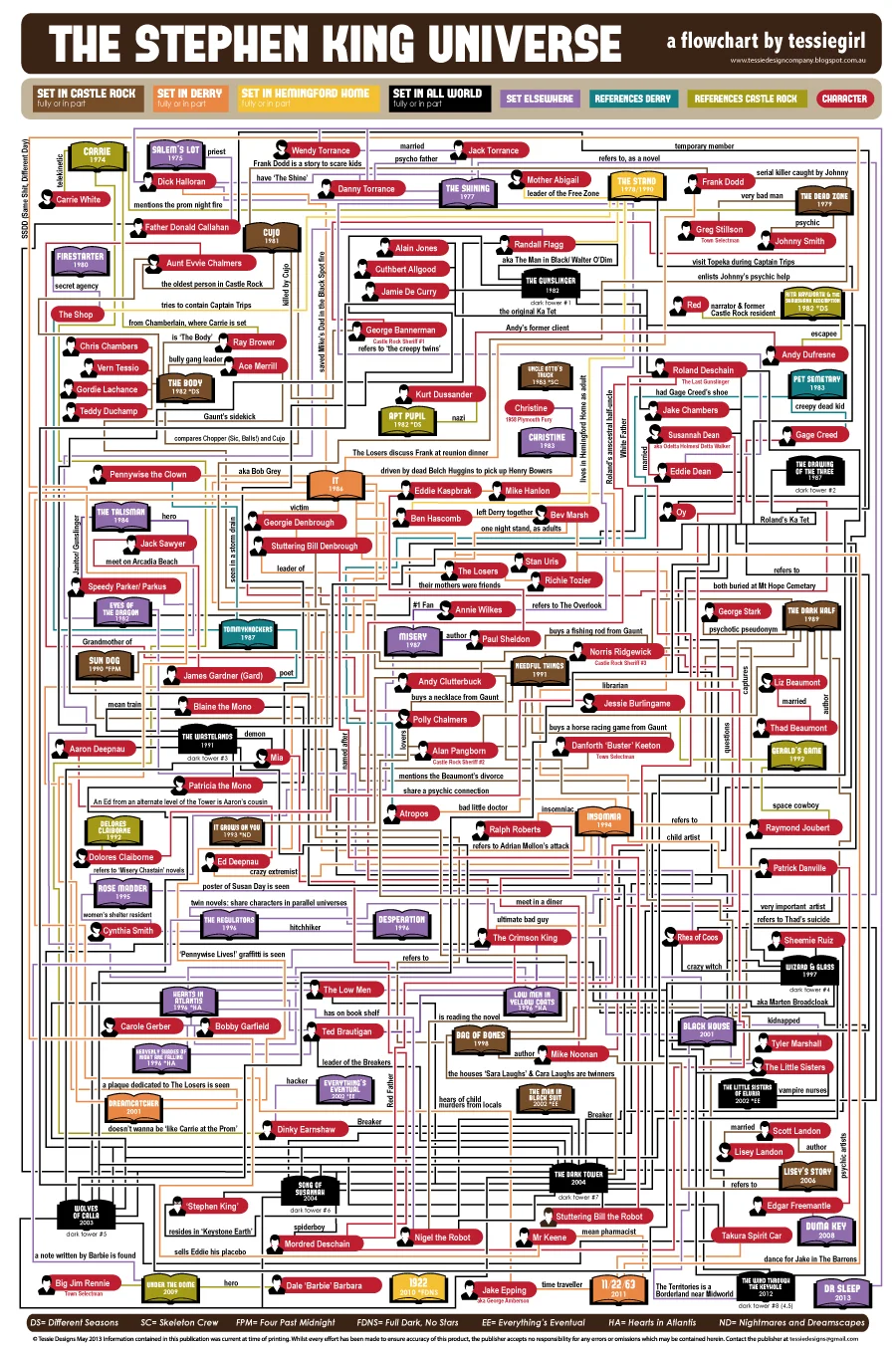
The Stephen King Universe
Randy Krum
Mar
5
Mar 5
Pairing Wine & Food
Randy Krum
Feb
11
Feb 11
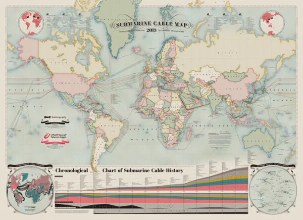
The Submarine Cable Map 2013
Randy Krum
Oct
5
Oct 5
The Supernatural Sprawl of True Blood
Randy Krum
Oct
3
Oct 3
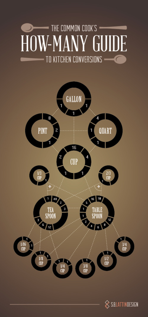
How-Many Guide to Kitchen Conversions
Randy Krum
Apr
27
Apr 27
Mapping Popular Story Plot Lines
Randy Krum
Feb
9
Feb 9
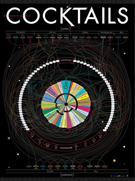
The Definitive Cocktails Poster
Randy Krum
Oct
31
Oct 31
The Diabolical Diagram of Movie Monsters
Randy Krum
Sep
20
Sep 20
The Internet of Things
Randy Krum
Sep
16
Sep 16
HBO Recycling Program
Randy Krum
Aug
31
Aug 31
Who Owns The Beer Brands?
Randy Krum
Jul
27
Jul 27
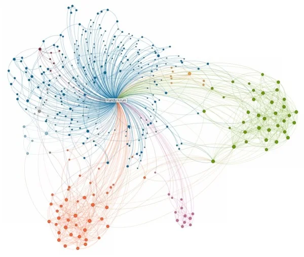
The VIZoSPHERE - Visualizing DataViz People on Twitter
Randy Krum
Jan
28
Jan 28
InMaps: Viewing Your Business Network
Randy Krum
Jan
20
Jan 20
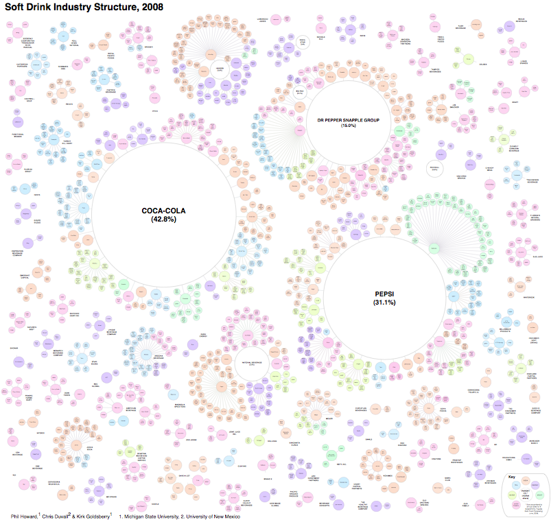
The Illusion of Diversity: Visualizing the Soft Drink Industry
Randy Krum
Load More