Home
Infographics
Book
Tools
Tools Directory
DataViz Guides
DataViz Shows
Word Clouds
Sankey Diagrams
Online Infographics Design
Online DataViz
Analytics Platforms
Infographic Resumes
Vector Graphics
Icon Libraries
Color Pickers
Presentation Design
JavaScript Charts
Free Stock Images
Jobs
Posters
Links
Appearances
About
Contact
Follow Cool Infographics
Need Infographics?
Randy Krum
Designer | Author | Instructor | Speaker
FREE Sample Chapter
Read More
All tagged
charts
Nov
8
Nov 8
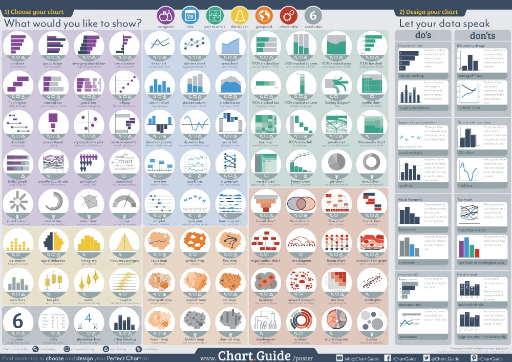
The Chart Guide v4.0 - Interview & Giveaway
Randy Krum
Apr
3
Apr 3
How the Tech Giants Make Their Billions
Randy Krum
Feb
27
Feb 27
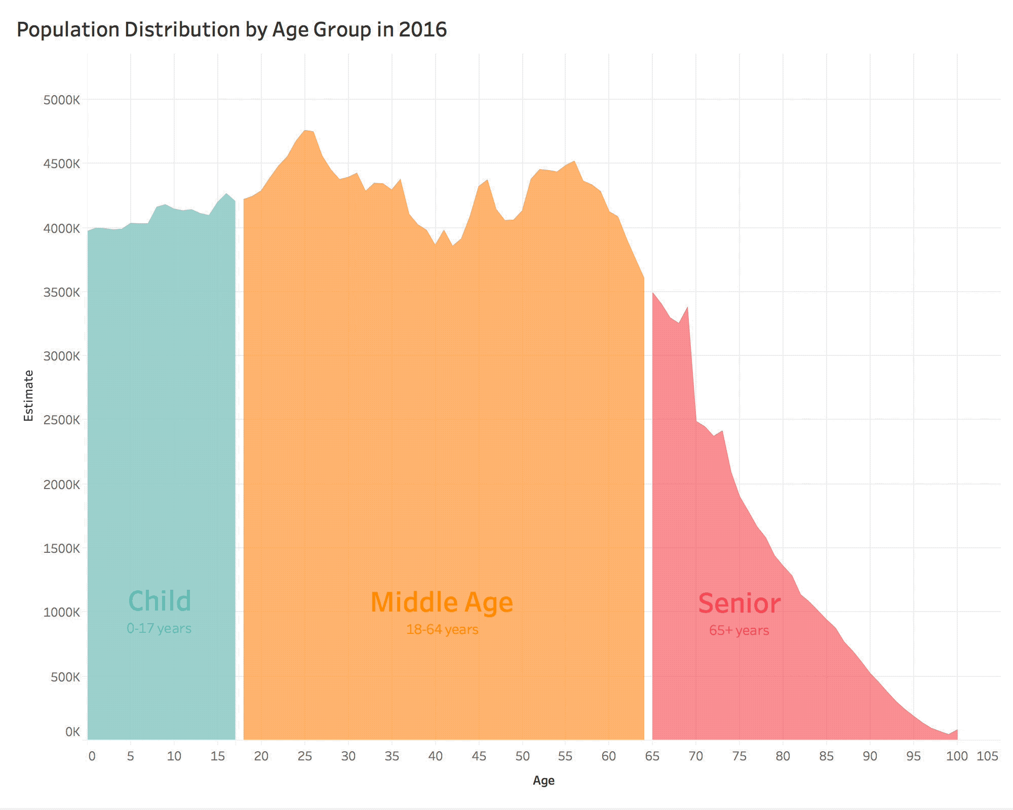
US Population Projections by Age Through 2060
Randy Krum
Jun
14
Jun 14
Giveaway: Design Better Charts in PowerPoint
Randy Krum
May
15
May 15
Evolution of the English Alphabet
Randy Krum
Feb
20
Feb 20
Aflac Brunch Commercial #BadDataViz Error
Randy Krum
Jan
28
Jan 28
Design Better Charts in PowerPoint Class on Skillshare
Randy Krum
Nov
23
Nov 23
Better Presentations by Jon Schwabish: Interview & Giveaway
Randy Krum
Aug
1
Aug 1
The Battery Life of iPhones
Randy Krum
Jul
7
Jul 7
Which Foods Are Really Healthy?
Randy Krum
Feb
17
Feb 17
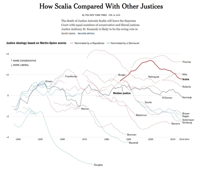
Great DataViz Design: Justice Scalia's Ideology
Randy Krum
Jan
7
Jan 7
Three Simple Resolutions to Design Better DataViz
Randy Krum
Jun
16
Jun 16
Visme 3.0 Design Platform Launches Improved User Interface
Randy Krum
Apr
7
Apr 7
Greek Mythology Family Tree
Randy Krum
Dec
24
Dec 24
The Graphic Continuum - Desktop Version
Randy Krum
Dec
4
Dec 4
The Pianogram
Randy Krum
Oct
10
Oct 10
5 Great Online Tools for Creating Infographics
Randy Krum
Oct
3
Oct 3
The Graphic Continuum
Randy Krum
Mar
18
Mar 18
The Power of ACC Basketball
Randy Krum
Jan
24
Jan 24
Famous Movie Quotes as Charts - the Poster
Randy Krum
Load More