


The U.S. MiseryMap of Flight Delays

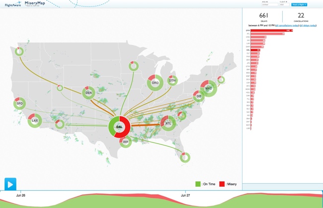
Stuck in an airport? The MiseryMap from FlightAware shows a real-time view of flight delays and cancelations at the top 30 airports in the U.S.
Doughnut charts highlight the totals for each major city (combining airports if there are multiple) and hovering or clicking a specific city will show the flight routes (sankey diagram style) that are experiencing delays and cancelations. The full details are shown in the barr chart sidebar.
Pressing the play button will animate the map for the last 48 hours showing the changes to the weather map overlay, and delays in 4-hour increments. The overall size of each doughnut also seems to represent the total number of flights from that city in each 4-hour increment.
Thanks to Mary Kaye for sharing the link!


