


Guide to the Final Four Ticket Pricing
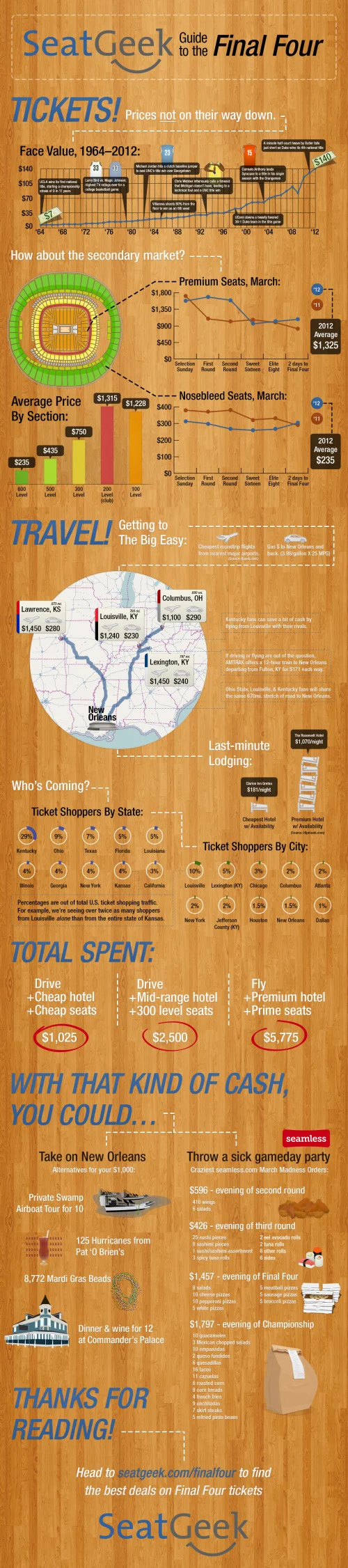
Timely for the Final Four on Saturday, the SeatGeek to the Final Four infographic takes a fun look at the expenses related to anyone headed to New Orleans to watch the Final Four games in person.
The infographic stands on its own nicely without any description, and I really like the design. Of course they used a basketball court wood flooring as the background, and carefully didn’t use any official Final Four logos from the NCAA. Even the jerseys are helpful illustrations and avoid using any official school logos.
I like most of the data visualizations. The line charts are simple, and the map is easy to read with clear driving paths. The Flying vs. Driving comparisons are also very easy to understand, but should have been visualized.
The design makes one big mistake! Only a couple data sources are mentioned at all (Kayak.com and Hipmunk.com), so we are left to wonder if the rest of the data is accurate. Did the rest of the data come from the SeatGeek servers? Where did the historical ticket prices come from?
The ticket price chart title indicates that they only charted the actual face value of the tickets, but they probably should have been adjusted for inflation. The doughnut charts for ticket sales by state and by city are hard for the viewer to compare, and I think it was a poor choice of visualization method. Aren’t these supposed to add up to 100%?
The visuals are very heavily weighted at the top of the design layout, and it’s disappointing that the information becomes mostly text at the bottom. My guess is that the designer was running out of time. The Total Spent values and the spending comparisons also should have been visualized. As an infographic designer, you should never make fake visualizations either (like showing 40 Hurricanes from Pat O’Brien’s next to the actual value of 125).
It’s interesting that they didn’t include the URL to the find the original infographic at the bottom, it’s really an ad URL to their Final Four page of ticket sales. I would have recommended including both URLs. There’s nothing wrong with the link to the sales page, but you should also include the infographic URL. There should also be a copyright statement at the bottom as well.
Thanks to Ryan for sending in the link!


