Blood Pressure: Know Your Numbers
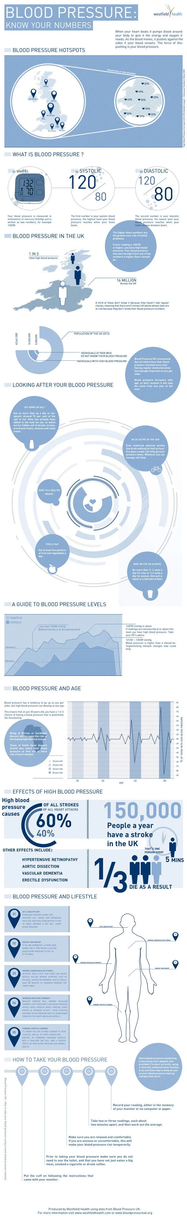
Being knowledgeable about your health is always helpful. Your blood pressure is no exception, 1/3 people who have strokes die because of high blood pressure. The Blood Pressure infographic created by westfieldhealth.com describes what blood pressure is, what it means, and then how to maintain a healthy blood pressure. The infographic was found on behance.net.
High blood pressure puts strain on your heart and increases your likelihood of developing health problems in the future. It is one of the most common causes of heart attacks and strokes, and is also a risk factor for heart disease, kidney disease and dementia. One in three people in the UK have high blood pressure even though just a few simple steps can help combat it. By checking your blood pressure, exercising regularly and reducing the amount of salt in your diet you can significantly lower your blood pressure and enjoy a healthier lifestyle.
The infographic provides some useful tips and advice about how you can keep your blood pressure in check.
This is a really good design with great information for people. I wish it was a little bit easier to understand though. A few of the data visualizations are not clearly explained.
In Blood pressure High Spots, I don’t understand what the size of each symbol on the UK map represents. The implication is the amount of reports high blood pressure cases, but the values are not shown. I don’t understand the right circle at all. The percentage numbers seem to be spread on a map, but it’s not the UK, and I don’t recognize it.
In Looking After your Blood Pressure, I think this diagram is completely artistic, even though it seems to imply that it’s a data visualization.
In A Guide to Blood Pressure Levels, the area chart seems to be a visualization over time of some sort, but no x-axis values are shown, so the readers can’t tell what this chart means.
Thanks to Luke for sending in the link!