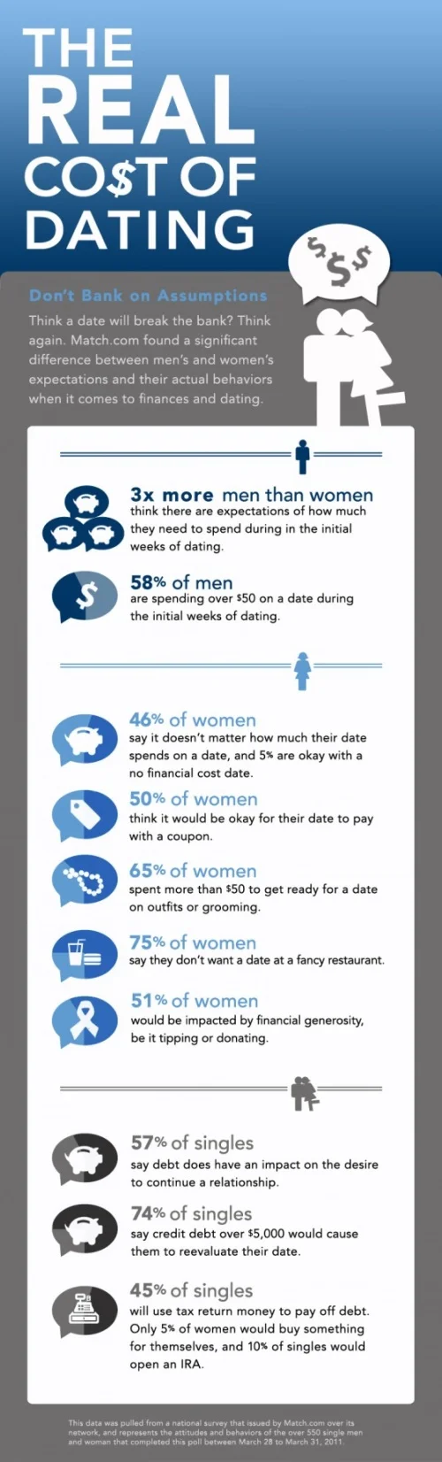
The Real Cost of Dating

This is a pretty simple one, but I appreciate when companies are willing to experiment with infographics and even design their own. The Real Cost of Dating is from Match.com and based on a survey they performed in March of 2011. So here, the company is putting their own, proprietary data out on the web to inform readers and draw them into the match.com blog.
First, I like the talk bubble used as a pie chart. It really helps reinforce the data as “Men say…”, “Women say…”. Although I think the design is too subtle. It took me a minute to even see that there were too colors in the bubbles.
Persoanlly, I think this design is very text-heavy, and much of the text is redundant. For example, each statistic includes the text “…of women” when they are already in a section of the infographic of just statistics from women.
Overall, good first swing at using infographics in your marketing strategy, and I hope they do more.
Thanks to Colin for sending in the link!