The Tweet Topic Explorer

Jeff Clark at Neoformix has created a cool, interactive tool that visualizes word frequency in a specific Twitter stream called Tweet Topic Explorer. You can enter anyone’s Twitter ID and it will generate an interactive visual on the fly. Above is the visualization of my Twitter ID: @rtkrum. According to Jeff (see note below), this works in most browsers but has trouble with Microsoft Internet Explorer.
Similar to a word cloud, the area of the circles is sized based on the frequency of that word in the Twitter stream. Words are clustered together and color-coded if they are often found together in the same Tweets. The actual text of the Tweets is displayed next to the visual, so you can click on any word and it’s highlighted in the text as well. Clicking on any Twitter names in the text will generate a new visualization for that Twitter user.
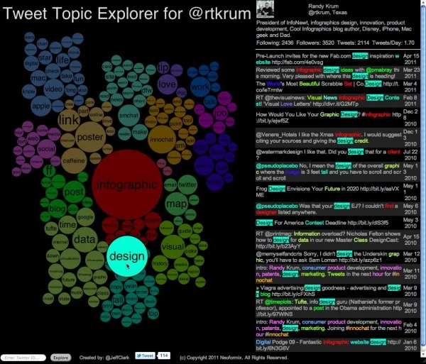
One issue I have is that the font size of each word is adjusted to fit within it’s circle, so longer words are naturally smaller to fit on one line withing the circle. So even if a long word has a higher frquency (and a larger circle area) it appears smaller to the reader’s eye because the font is so small.
I have created a new tool to help see which topics a person tweets about most often. It also shows the other twitter users that are mentioned most frequently in their tweets. I call it the Tweet Topic Explorer. I’m using the recently described Word Cluster Diagrams to show the most frequently used words in their tweets and how they are grouped together. This example below is for my own account, @JeffClark, and shows one word cluster containing twitter,data,visualization,list,venn, and streamgraph. Another group has word,cloud,shaped,post etc. It’s a bit hard to see in this small image but there is a cluster about Toronto where I live and mentions of run, marathon, soccer. Also, there are bubbles for some of the people on Twitter I mention the most often: @flowingdata, @eagereyes, @blprnt, @moritz_stefaner, @dougpete.

This application was created with the wonderful tool Processing.js which is the javascript-based extension of the Processing tool I have used in the past. Performance is very good with the Chrome browser, and decent in Firefox and Safari. It will not work in Internet Explorer (except perhaps the new IE 9) and currently crashes on iOS devices.
Anyone out there still reading? Generate a visualization using your Twitter ID and post a link in the comments!
Outstanding job Jeff!
Found on FlowingData
Update
on 2011-05-01 14:35 by Randy
Jeff added the ability to visualize Twitter lists. Here’s the link wwhere you can see the Tweet Topic Explorer for the Cool-Infographics-People list.