SoTech Infographic v1.0 - your feedback requested
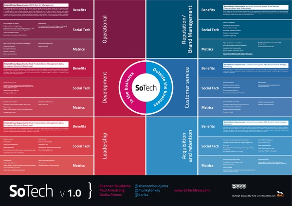
The SoTech Infographic v1.0 was released during the Social Collective 2010 Conference in London last week as a visual way to show how social networks interact with the different functions of business. The infographic was created by Hold, a Brighton based graphic design studio.
Introduced at Social Collective, Darika Ahrens, Shannon Boudjema + Paul Armstrong presented an infographic (created by http://www.wearehold.com) that demonstrates how social technologies work within a business + outside a business -
The infographic is available in a number of formats, like PDF and JPG, Scribd and Slideshare. An online copy of the presentation from the conference is below (using Prezi, a great visual presentation tool!). I agree with their thoughts on using infographics as a conference tool as well.
SoTech - How social media works inside and outside the business [INFOGRAPHIC LAUNCH] on Prezi
Both on the SoTech Now website, and the email I got from Paul Armstrong, is the invitation to heavily critique this v1.0 of the infographic. They would like to develop and release v2.0, but are looking to incorporate all of the feedback they can get. Leave comments below or on the SoTechNow site with your own reactions.
Here are some of my initial thoughts (mainly on the design):
Very text heavy.
Readability is low. I’m a fan of big infographics that allow you to zoom in and dig deeper into the details, but in this version, by the time you zoom in close enough the read the text, you’re too close to understand the context.
Use icons, at least for the different business functions
Show examples of sites in each of the “Social Tech” sections. Otherwise it seems like wishful thinking that there is a product that successfully does each of these functions.
Show examples of the metrics. Are these actually quantifiable?
I think the infographic does provide a great framework to either develop a social plan, or to evaluate an existing plan. It would be fascinating to review a company’s efforts using this framework as an example of social media being used successfully (or not) by a corporation.
What do you think?