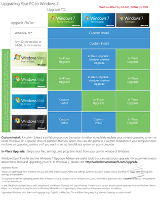
Improved Microsoft Windows 7 Upgrade Chart
The chart above is NOT from Microsoft.
Ed Bott, over at ZDNet, was able to quickly redesign the Windows 7 Upgrade Chart from Microsoft in about an hour. And Ed's a journalist.
The original chart (below) is unnecessarily complicated and hard to comprehend. I generally don't post about bad infographics, but in this case Ed was able to re-do Microsoft's chart into the improved, simpler version you see above.
Honestly, the upgrade process is still too complicated and Microsoft should be ashamed of themselves. This deserves a new Mac vs. PC ad just by itself.
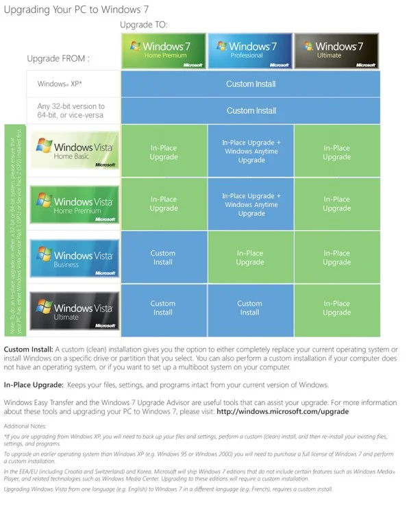
Found on Engadget and All Things D.
Here's the official "horrendous" (I don't get to use that word often) chart from Microsoft.